BYERS
The original 1940’s house had been extended at some point and in some areas. For
example, the kitchen had been renovated, unfortunately on a tight budget. The existing kitchen was a confusing decorative solution from IKEA, good for flipping houses but not for long term use. After a couple of years tolerating the existing kitchen, the clients decided to engage FOUND in the hopes of elevating their experience, by installing a quality product into their space.
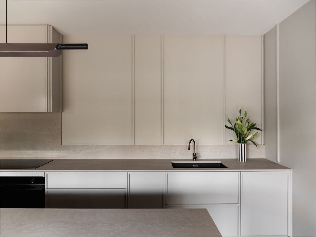
The room was long and slightly narrow, so it was important to once again create a feeling of as much space as possible. We did this by unifying colours and materials, allowing the forms in the space to blend into one another
this made the room feel less cluttered and as a result, larger. There was ample storage under-bench, so we didn’t have to install overhead cabinetry which can shrink the boundary of a room, making a space feel smaller than it actually is.
Functionally, we provided long lengths of bench, allowing for lots of drawer storage – 20 drawers in the kitchen alone, the entire island dedicated to storage. We moved the sink to the back wall making sure we didn’t crowd the hotplate. Moving the sink off the island created a more inviting view as you enter the room. The island, sans sink, is now a more attractive place to entertain from, as you no longer need to navigate dirty dishes or worry about splashing a guest.
Slatted end panels anchor the island, adding a unique visual element.
These panels allow you to see through the space, creating a feeling of lightness.This is instead of the common stone-waterfall end that tends to close-off space and make the island feel heavy in a narrow space.
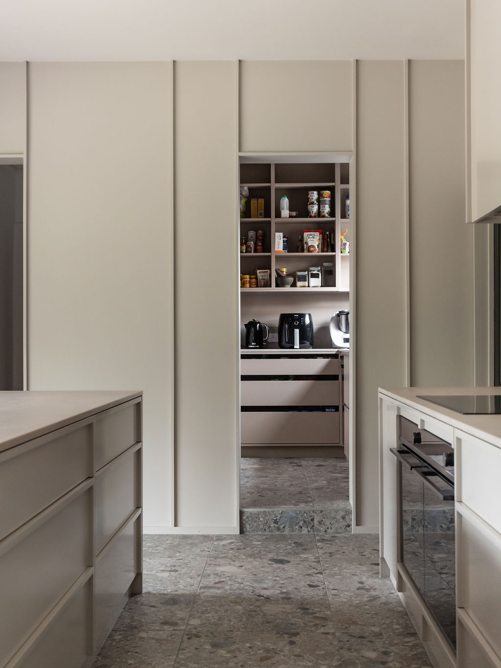
The kitchen, butlers pantry, lounge and dining areas were unified by tiled Ceppoflooring.
This tile created a distinctive, soft base which contrasted nicely against the cabinets, pulling you gently through each room, blurring thresholds.
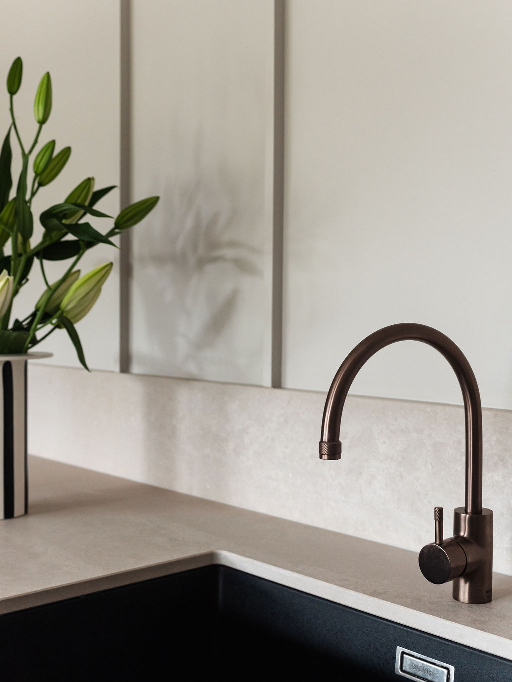
To add a final layer of warmth, we added a feature bronze sink mixer and pendant light to the design, providing our clients with a calm place to start their day and an amazing space to welcome friends and entertain.


