LEEN

To most people the existing kitchen probably didn’t look or feel that bad, but the client wanted to update and breathe more life into the space. Upon closer inspection we found that there were a few issues with functionality and that by addressing these issues we could create a space that was much easier to use over the coming years.

FOUND Kitchens - Sink head on
FOUND Kitchens - Oven tower, cooktop terrazzo splash

The existing sink position was in the middle of the room and needed to be relocated to allow more functionality on the long u-shape return that divided the dining space. Relocating the sink made it feel like it was actually part of the kitchen, as opposed to being a part of the dining space. No longer was there a need to cross over the space from hotplate to sink. The person using the hotplate could travel with hot items now at all times over the bench top and not come into contact with anyone else.

Being a u-shaped kitchen, we had two corners to deal with. We made use of one corner by installing a lemans corner system. These are great as the corner comes out to you and can be used for larger pots or appliances as well as crockery if desired. We closed in the other corner, allowing more space for long drawers and the ability to reposition the sink.

FOUND Kitchens - Island corner detail, pantry
FOUND Kitchens - Island return bench to mixer

There was limited space on the hotplate run to the existing window and it felt a little crowded. We clawed back 150mm from the existing tall oven tower which allowed for more length on the benchtop. We used an 800mm wide hotplate in the cooking zone, which was now more spacious compared to the existing design where the hotplate was hard up against the oven tower.

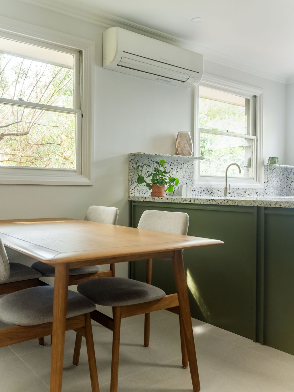
The house was a 1940’s or 50’s build with decorative cornices and a ceiling height of 2550mm. The cornices looked great in the room, but they made the overheads and tall cabinetry feel very top heavy and also made the ceilings feel a little lower than they actually were. We intended to use a strong colour for the cabinetry, and we wanted to try and extend this visual line all the way up to the ceiling. To do this, we discontinued the cornices 20-30mm away from the cabinets, mitring the ends and providing an elegant, neat finish. This considered alteration resulted in a lighter feel to the space.

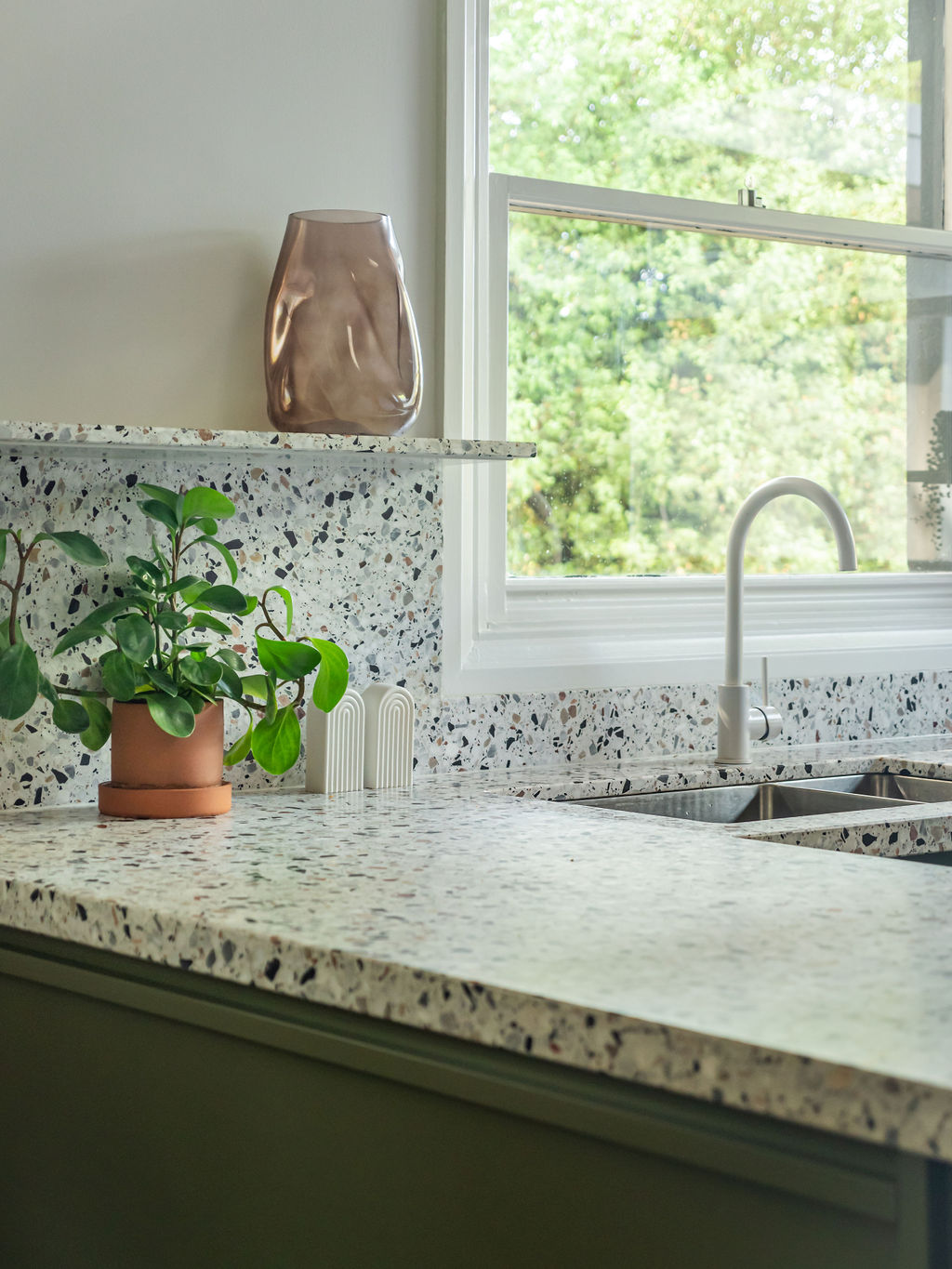
FOUND Kitchens - Terrazzo Benchtop, touch of nature
FOUND Kitchens - Table, terrazzo bench and shelves

New, lighter floor tiles were laid, making the space feel much more inviting. Bespoke cabinetry handles and detailing added a level of decoration to the design without having to rely on a generic ‘shaker’ door. The client was very keen to use terrazzo for the bench tops and we found one with autumnal chips in it on a white background to balance out the bold use of colour on the cabinets.

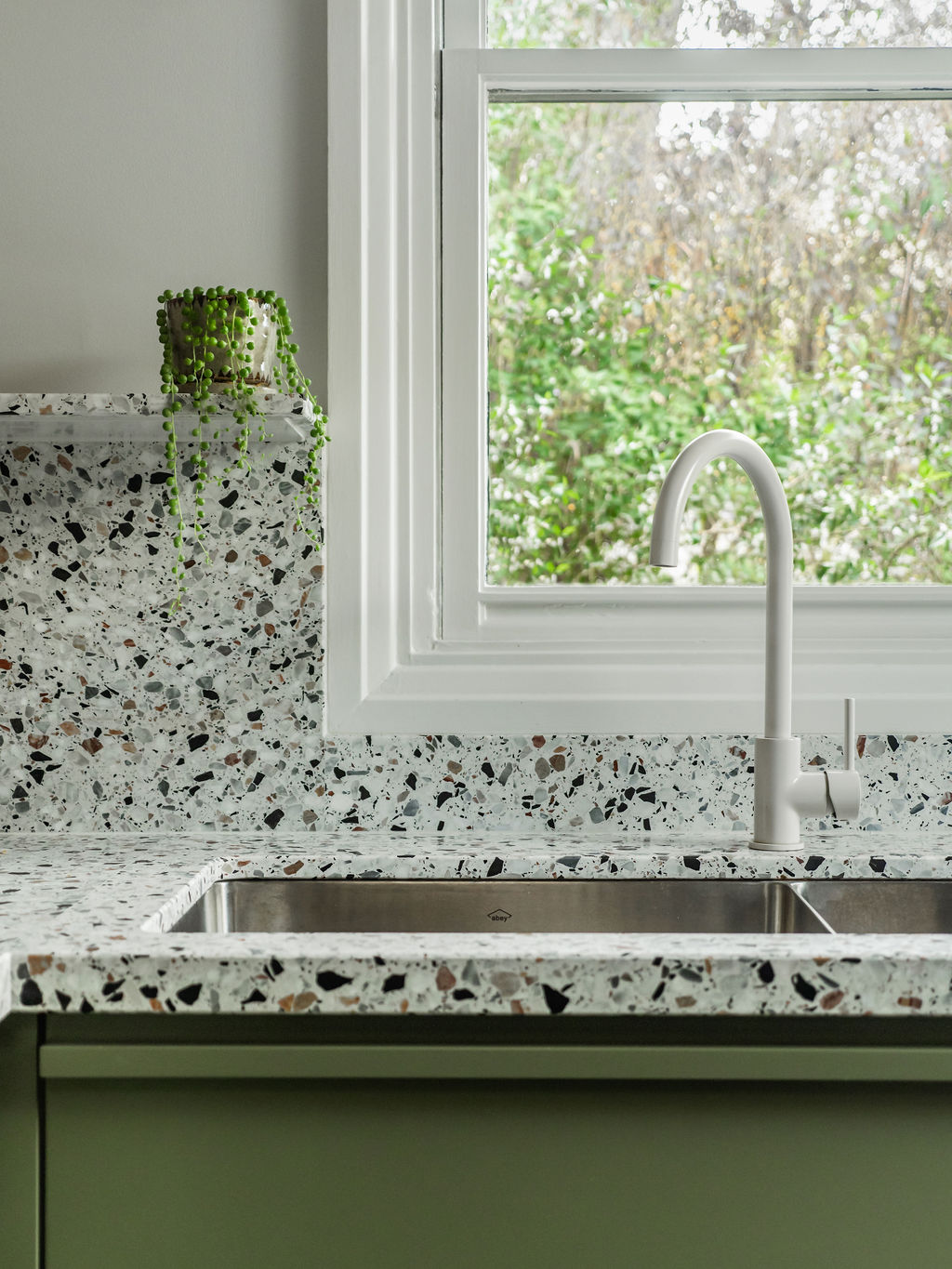
Using this same material for the splash backs and shelving made the space feel a little larger, your eye focusing on one material as opposed to two. We picked out one of the tones in the terrazzo for the rangehood cabinet colour, tying these together. Through carefully considered colour selections, detailed cabinetry work and improved functionality, we created a dynamically designed space for the clients to enjoy.

FOUND Kitchens - Sink and kitchen mixer