RUBANS

A mid-century house, home to a design-savvy couple and their gorgeous greyhound. The couple had been slowly renovating the property back to its former Mid-century glory. Unfortunately, the period kitchen didn’t meet the client’s standards or their needs for functionality.

The challenge here was to create a stylish functional design, but it had to fit into the exact same footprint of the existing kitchen. This really can be limiting, but it was a challenge that FOUND were keen to accept.

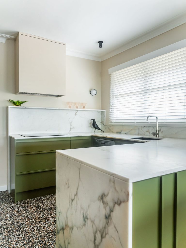
The existing kitchen was quite a small u-shape with tall cabinetry opposite, then a thoroughfare running between through to the backyard. We began by listing all the items and appliances that needed to be accommodated and quickly realised that it would be a challenge to fit everything in.

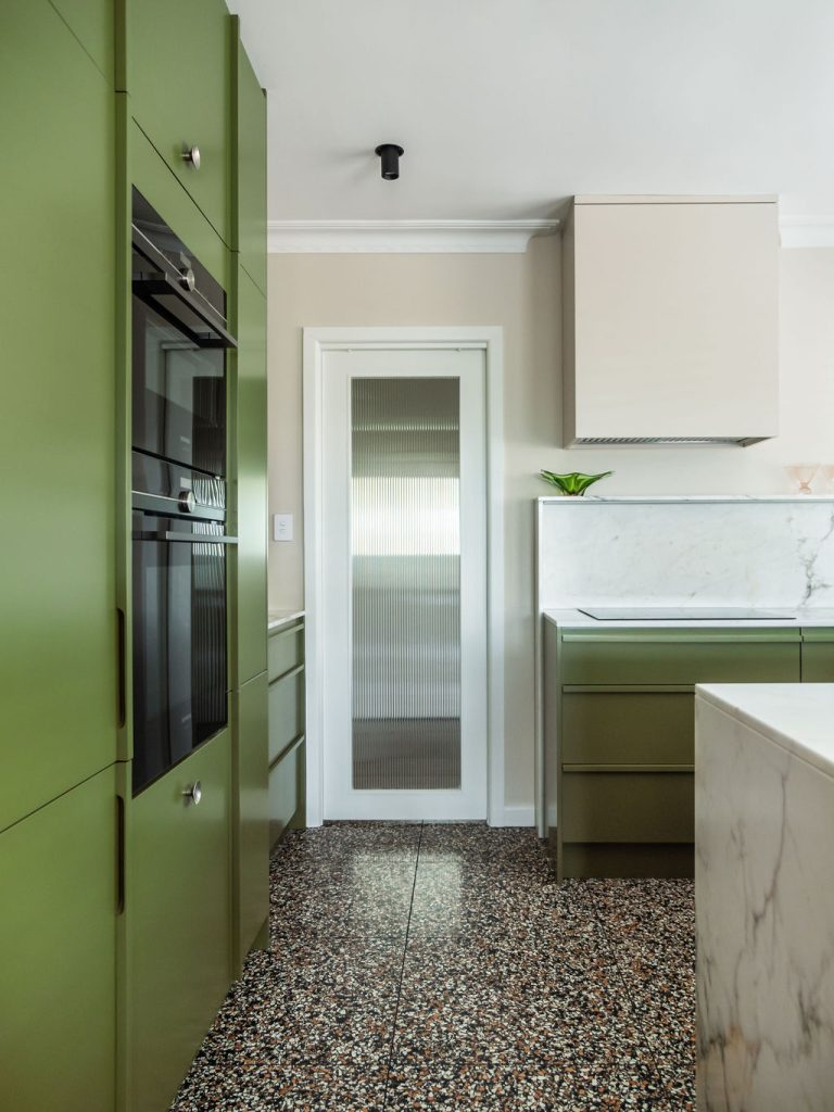
So, a few minor construction changes needed to be made. We altered the door to the rear of the house into a cavity slider which allowed us to then use the space to the left of the door. Here we installed a benchtop with deeper, more useful cabinetry. We also removed a nib wall that defined the existing fridge space which allowed us to use all the available space along that side for cabinetry.

Through carefully considering the location of each appliance, we were able to make the most of this tall cabinetry run. Using an integrated 600mm wide fridge freezer combo, we gained an extra 300mm in width that could be put to better use for an oven tower and pantry with inner drawers.

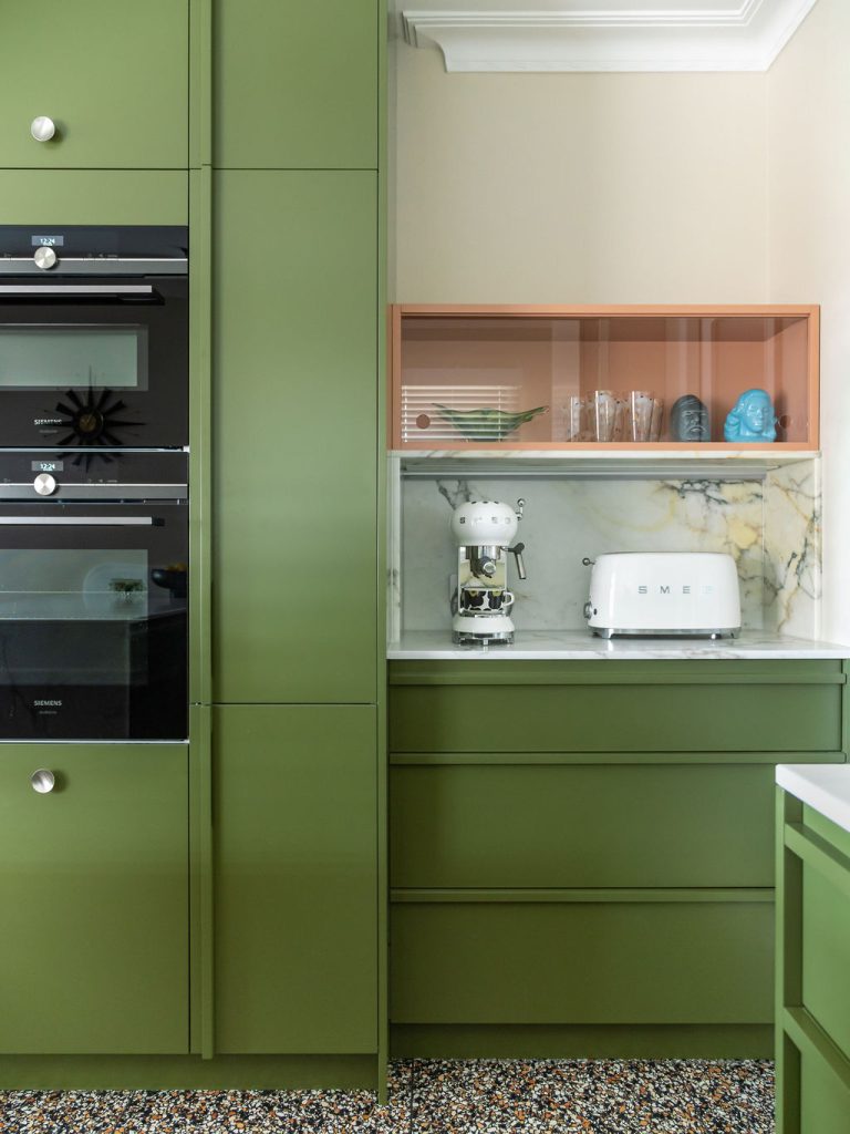
Placing the oven and fitted microwave at waist and eye-height in a tall cabinet made these appliances easily accessible with no more bending over to check on dinner. This also freed up valuable storage space under the bench, back in the u-shape section of the kitchen. Unbelievably, in this smaller kitchen, we still managed to fit 20 drawers, which are the most functional way to access cupboard space.

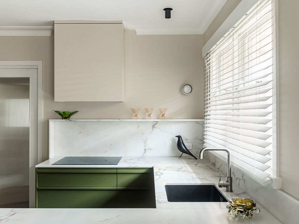
We visually cleaned up the u-shape section of the kitchen by using a 75cm induction hotplate and a large 50cm wide single-bowl sink. This allowed for extra useable bench space. We resisted the urge to use overhead cabinets and painted the rangehood cabinet to match the walls, resulting in a more spacious view to the end of the room.
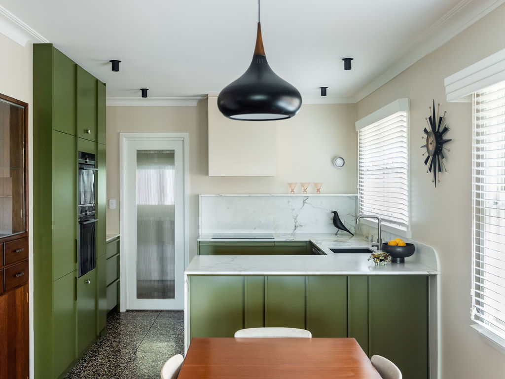
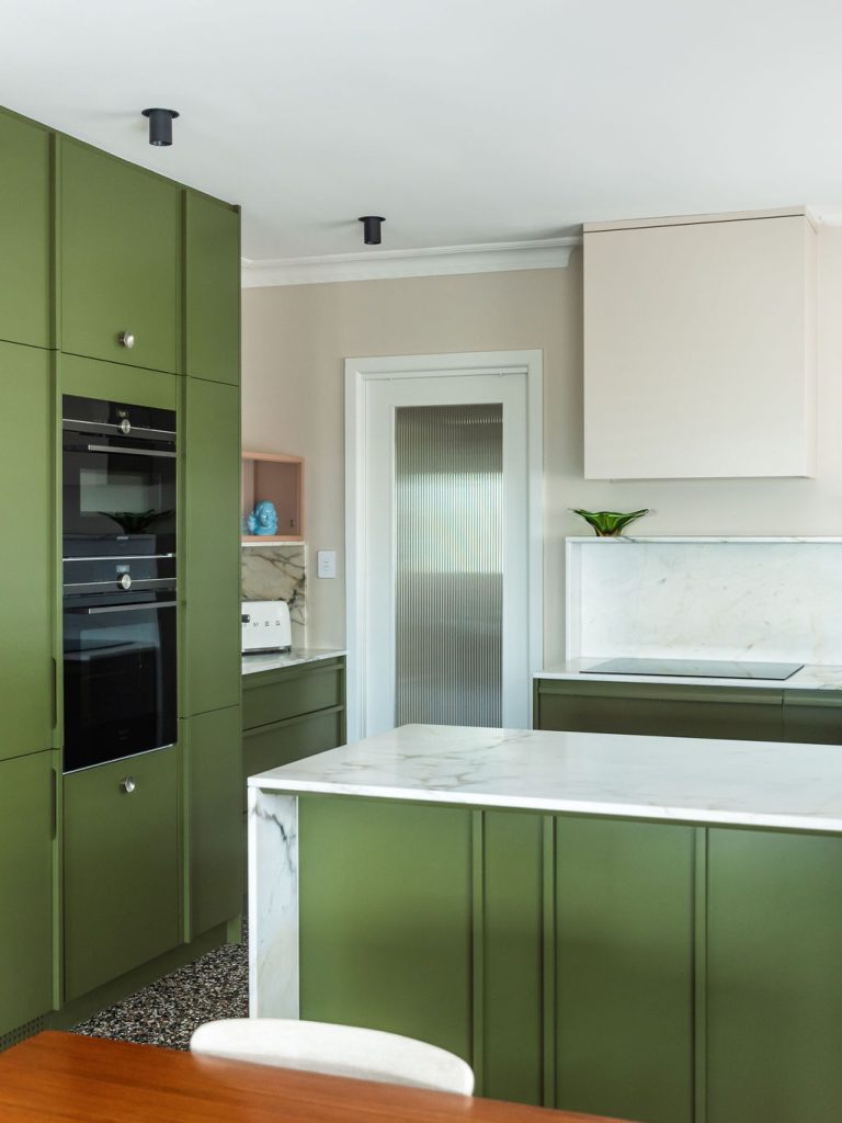
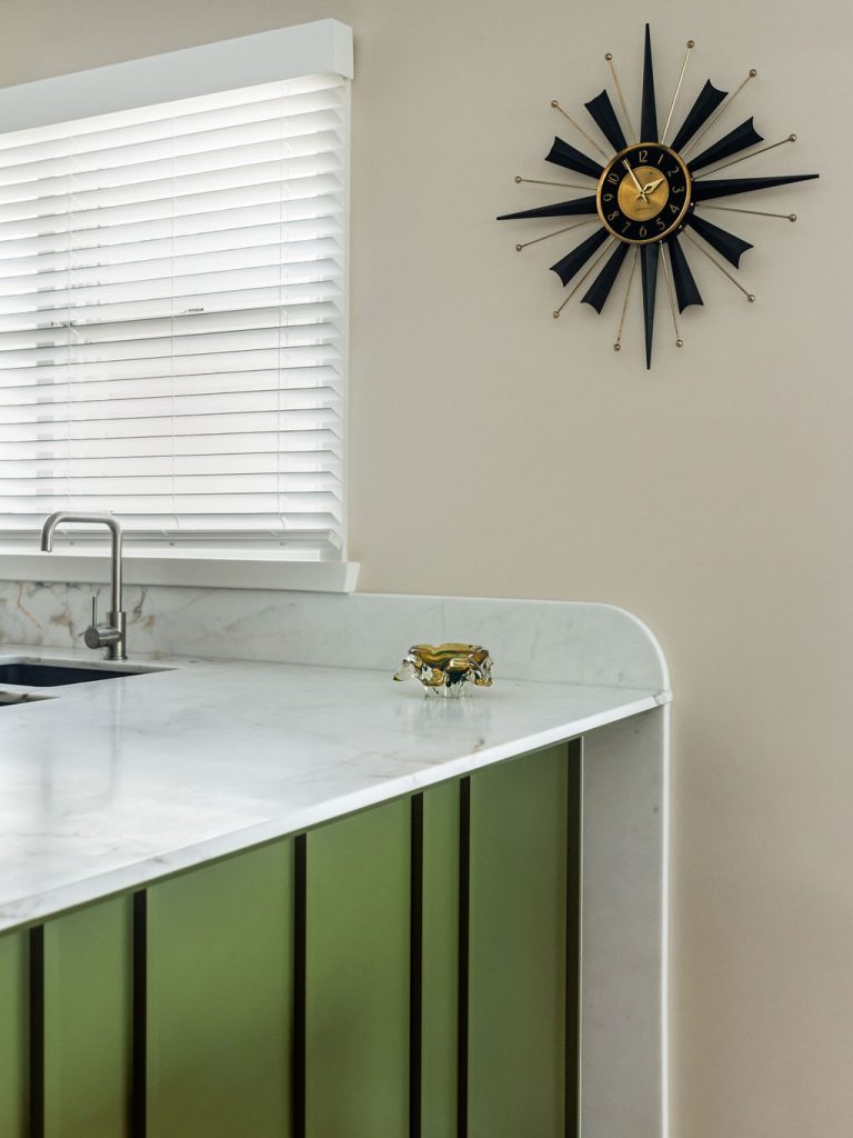
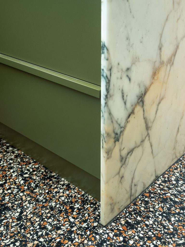
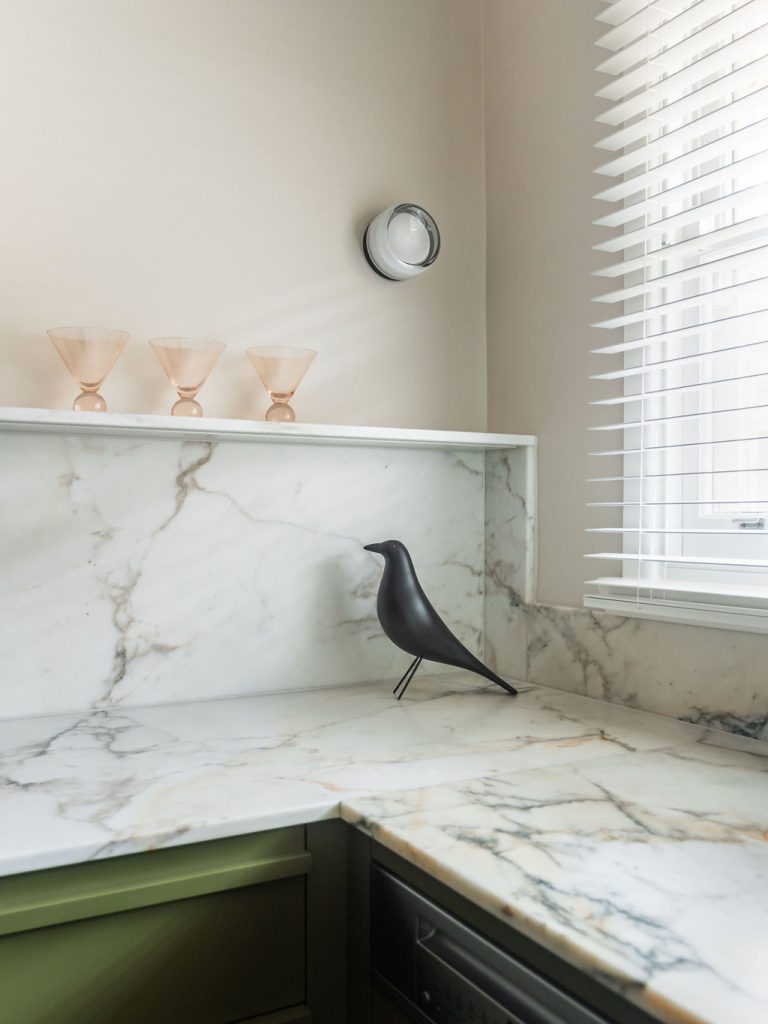
Using Mid-century colours and materials, terrazzo flooring, marble benchtops and splashbacks and bespoke detailing on the cabinetry resulted in a visually stunning design. The pop of pink was a bit of fun to offset the green cabinetry and existing timber floors.

The pink and terracotta coloured terrazzo tiles provided a sound visual base for our design and a contrast to the green of the cabinetry.